About
Less resizing. More designing.
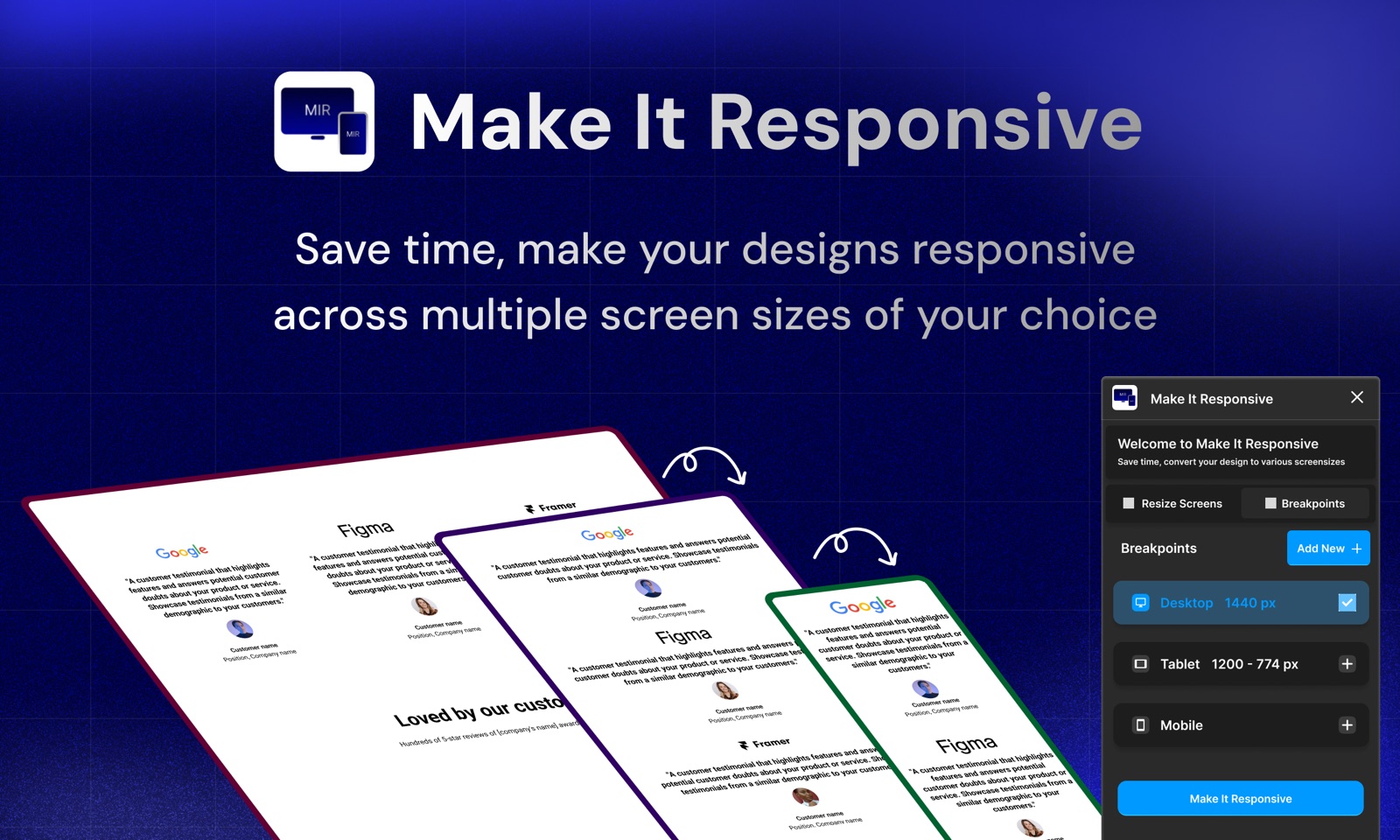
Make It Responsive is a Figma plugin for one tedious job: adapting a finished design to other screen sizes.
Why it exists
Most designs start at one size. Turning that screen into tablet and mobile versions means rebuilding the same content again: resizing frames, re-stacking columns, nudging spacing. It's necessary work, but it isn't where design decisions happen.
Make It Responsive takes on that repetitive part inside Figma. You pick a screen size and the plugin resizes the frame and adjusts its layout, so your time goes into refining it instead of rebuilding it.
21.6k
designers have used it on Figma
50
free responsive inputs every month
What we care about
Built to be useful, and straightforward about it
Stays inside Figma
No separate app and nothing to export. The plugin doesn't send your designs to any server.
Honest about the result
The plugin gives you a strong starting point. We'd rather say that plainly than promise pixel-perfect layouts.
Simple pricing
A free plan to try it, then a monthly plan or a one-time purchase. That's the whole list.
Spend less time resizing by hand
Install the plugin from the Figma Community and try it on your next design. The free plan includes 50 responsive inputs a month.
Try free in Figma(opens in a new tab)